The Role of Color Psychology in Creating Efficient Minimalist Spaces
Understanding Color Psychology in Minimalist Design
Color plays a vital role in shaping our emotions and influencing our behaviors, making it an essential element in interior design. In minimalist spaces, where simplicity and functionality take center stage, the selection of color can dramatically enhance the ambiance of a room. By applying the principles of color psychology, designers are equipped to create environments that not only look aesthetically pleasing but also promote well-being and productivity.
Why Color Matters in Minimalism
When designing efficient minimalist spaces, it is critical to consider the psychological implications of color. Various hues evoke distinct feelings, making them suitable for particular functions within a space. Understanding how color impacts mood and behavior empowers designers to maximize the effectiveness of their designs. Here are some key colors to consider:
- Blue: Often associated with the sky and the ocean, blue promotes tranquility and concentration. This is why it is commonly used in offices and study areas to create a calm, focused environment conducive to productivity.
- Green: Symbolizing nature and renewal, green enhances creativity and fosters a sense of tranquility. It is increasingly used in spaces where brainstorming or creative activities happen, as it can help reduce stress and inspire innovative thinking.
- Yellow: A bright and cheerful color, yellow stimulates optimism and energy. Designers often incorporate yellow accents in kitchens or recreational areas to invoke feelings of happiness and warmth, inviting social interaction and engagement.
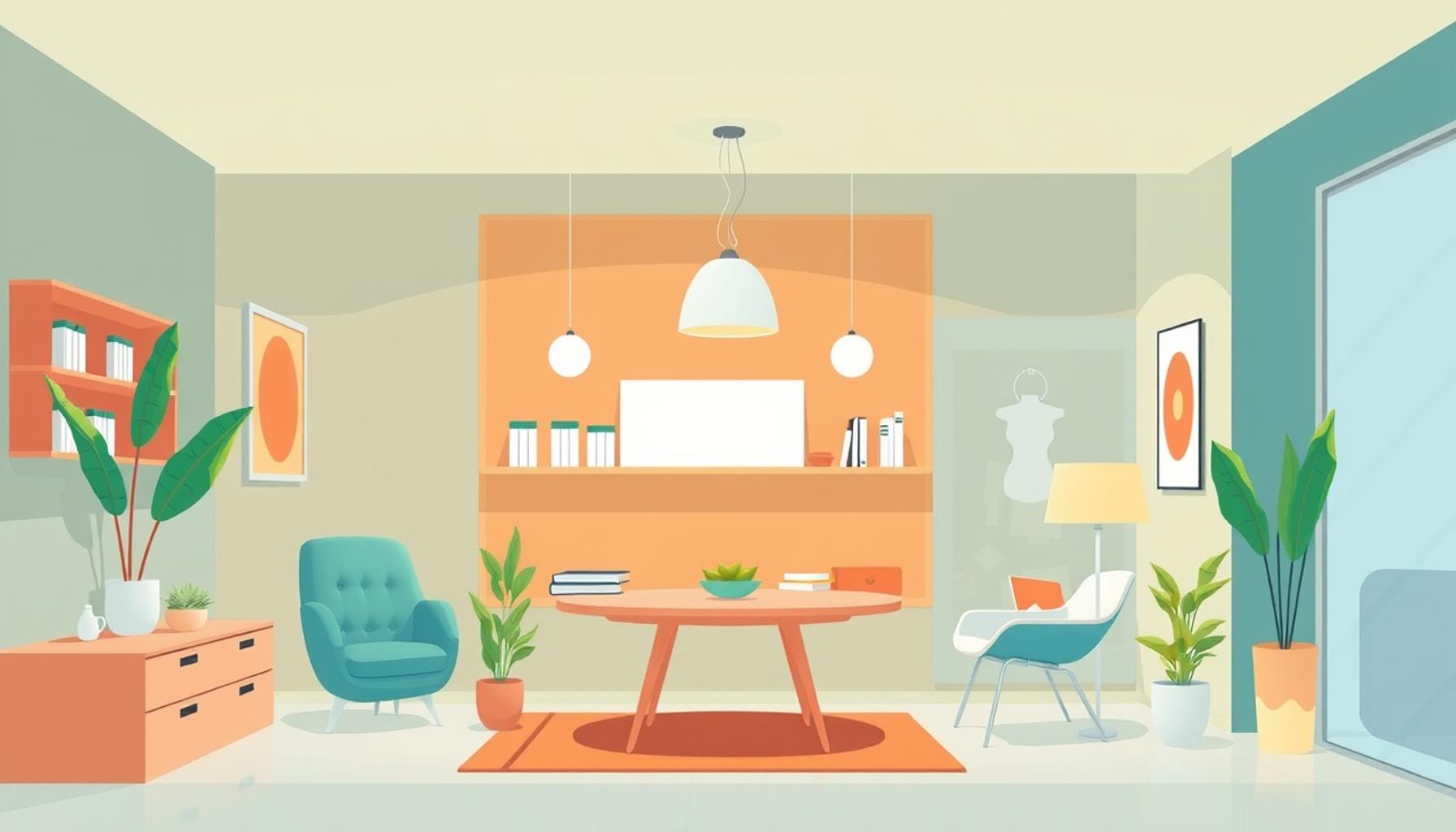
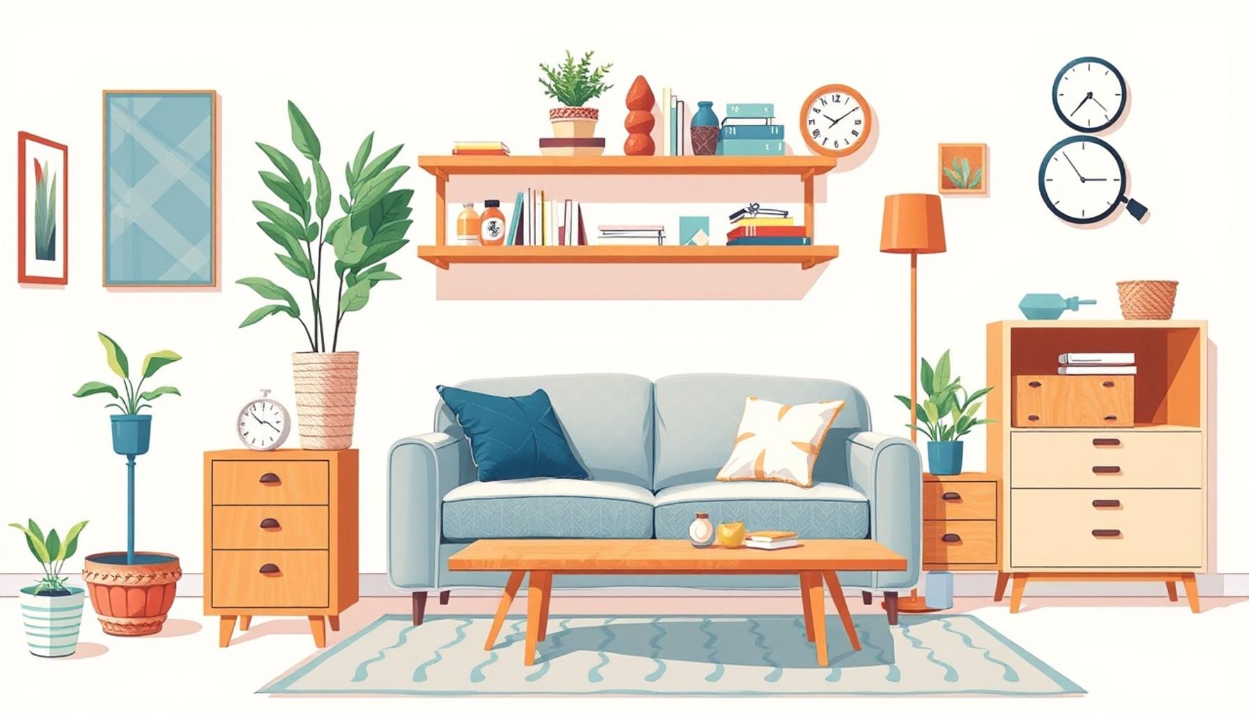
- White: Often seen as the epitome of minimalism, white conveys simplicity and cleanliness. It serves as a blank canvas, allowing other elements in the space to shine. Additionally, it can make small spaces feel larger and more open.
- Gray: As a neutral color, gray provides a sophisticated and balanced backdrop. Its versatility allows it to complement other colors effectively, making it a popular choice for minimalist environments aiming to achieve a refined aesthetic.
Each color interacts differently with light and space, impacting how a room is perceived. For instance, pale colors tend to reflect more light, making smaller areas feel larger and airier. Conversely, darker shades can create a sense of intimacy, making them ideal for bedrooms or reading nooks where relaxation is the priority. By integrating these color dynamics, designers can craft efficient minimalist spaces that not only fulfill aesthetic demands but also serve practical needs, ultimately enhancing the quality of life for occupants.
Exploring color psychology in interior design opens a door to understanding how our environments influence our daily experiences. As minimalism continues to gain traction in the United States, recognizing the emotive power of color will be essential for designers, homeowners, and anyone looking to create spaces that resonate with peace, creativity, and joy.
DISCOVER MORE: Click here to delve deeper
The Influence of Color on Efficiency and Mood
As the intersection of psychology and design, color psychology provides invaluable insights for creating efficient minimalist spaces. In these settings, every detail matters, and color is no exception. It holds the power to transform a simple structure into a sanctuary of efficiency and inspiration. Research shows that the colors we surround ourselves with can subtly influence our productivity levels, emotional well-being, and even our physical health. Therefore, choosing the right hues is crucial for a successful minimalist design.
The Emotional Spectrum of Color
To harness the effects of color psychology effectively, one must first understand the emotional responses triggered by different colors. Each color has its unique characteristics and psychological associations that can shape how individuals experience a space. Consider the following emotional responses tied to various colors:
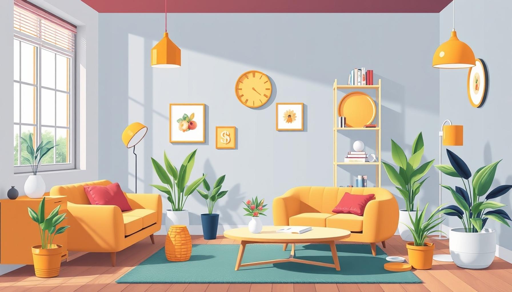
- Red: This dynamic color is linked with energy and urgency, often provoking excitement. While it can spur creative energy in social environments, it may not be suitable for spaces meant for relaxation or deep focus.
- Orange: Combining the warmth of red and the cheerfulness of yellow, orange is both invigorating and sociable. It fosters communication and enthusiasm, making it a wise choice for family rooms or collaborative workspaces.
- Purple: Traditionally associated with luxury and creativity, shades of purple can inspire imagination and holistic thinking. However, overusing darker purples can lead to feelings of melancholy, so balancing it with lighter tones is essential.
- Black: While often regarded as austere, black can create a sophisticated atmosphere when used appropriately. In minimalist designs, it can accentuate other colors and shapes, adding depth and elegance.
- Pastels: Soft pastel shades can foster a sense of calm and serenity. They are excellent choices for spaces designed for relaxation, such as bedrooms or meditation areas, promoting a peaceful state of mind.
Incorporating these colors into minimalist spaces involves not just aesthetic choices but also strategic planning. For example, using cooler colors in workspaces can maintain focus, while warmer colors might be used as accents to stimulate creativity and interaction. The careful selection of a color palette can enhance the efficiency of the space, providing a harmonious blend of functionality and comfort.
The ever-evolving relationship between color and minimalism is more than just a trend; it’s about crafting environments where individuals can thrive. As more homeowners and designers turn to minimalist principles, the relevance of color psychology becomes increasingly significant. Understanding how different hues interact with our emotions can lead to the creation of thoughtful environments that not only serve our practical needs but also elevate our daily experiences.
| Color Selection | Impact on Space |
|---|---|
| Neutral Tones | Promote calmness and focus while ensuring minimal distractions. |
| Accent Colors | Introduce energy and stimulate creativity without overwhelming the senses. |
The application of color psychology in minimalist spaces revolves around thoughtful selections that enhance functionality and aesthetic appeal. Neutral tones, such as whites, grays, and soft beiges, form the foundation of these spaces. They are essential for fostering a serene atmosphere conducive to concentration. When individuals work or relax in a setting dominated by neutral hues, they experience a heightened sense of clarity that allows for greater productivity.Conversely, the use of accent colors plays a crucial role in defining different areas and injecting personality into a minimalist design. By implementing bright yellows, deep blues, or lush greens as accent colors, homeowners can create focal points that energize the entire environment. It is crucial to balance these colors effectively to maintain the minimalist essence while still ensuring a dynamic vibe that encourages innovation and engagement. Such harmonious color arrangements can significantly affect mood and behavior, making it imperative to choose wisely when designing efficient minimalist spaces.
DISCOVER MORE: Click here to learn about creating meaningful spaces
The Tactical Application of Color in Minimalist Design
Understanding the emotional responses to color is only the beginning; the real art lies in strategically applying these colors within minimalist spaces. By purposefully integrating hues that promote productivity and calmness, designers and homeowners alike can create environments that enhance both function and aesthetic appeal. The concept of minimalism—characterized by simplicity and intentionality—carries with it a profound opportunity to utilize color as a vital tool in design.
Building Cohesion Through Color Schemes
One of the most effective methods in minimalist design is the creation of cohesive color schemes. Utilizing a limited palette can create a harmonious look that feels both organized and serene. Often, designers opt for a base of neutral colors such as whites, grays, and beiges to establish a sense of tranquility. These light hues serve as a blank canvas, allowing accent colors to jump out without overwhelming the space.
For instance, incorporating navy blue accents can elicit feelings of stability and professionalism, making it a suitable addition to home offices or study areas. Similarly, variations of green, reminiscent of nature, can instill a sense of renewal and calmness, lending itself well to living rooms or meditation spaces. The choice of accent colors can also shift based on seasonality, allowing for dynamic yet controlled transformations in the ambiance of a room.
The Impact of Lighting on Color Perception
Another crucial aspect of utilizing color in minimalist spaces is understanding how lighting affects color perception. The interplay between natural and artificial light can drastically alter how color appears in a space, influencing its mood. For example, natural daylight can enhance the vibrancy of colors, amplifying the energy of yellows or the freshness of greens during daytime. Conversely, the warm glow of artificial lighting in the evening may soften harsh hues, creating a cozy ambience that encourages relaxation.
It’s essential to consider the orientation and size of windows when planning color schemes. Spaces with abundant natural light can accommodate bolder choices, while smaller, darker areas may benefit from lighter tones to enhance the feeling of spaciousness. This is especially true in the often compact environments typical in urban living, where the right utilization of color and light can create an illusion of depth, comfort, and style.
Color Zones for Functionality
Employing color zoning can also enhance the functionality of minimalist spaces. This technique involves using different colors to demarcate areas and create visually defined niches for various activities, such as work, relaxation, and social interaction. For example, a small studio apartment can utilize a soothing sage green for the sleeping area, transitioning into a lively coral or optimistic yellow for the workspace. This delineation fosters a sense of purpose and can improve focus in designated areas, enhancing overall efficiency without sacrificing the minimalist essence.
Moreover, embracing color zoning helps cater to diverse emotional needs, allowing inhabitants to experience varying psychological responses in the same space. By understanding these dynamics and intentionally using color, both designers and homeowners can maximize the comforting and functional aspects of their minimalist designs.
DISCOVER MORE: Click here to dive deeper
Conclusion: Embracing Color Psychology for Enhanced Minimalist Design
In summary, the impactful role of color psychology in creating efficient minimalist spaces cannot be overstated. By carefully selecting colors that evoke specific emotions and responses, designers and homeowners can transform even the plainest environments into harmonious havens tailored to individual needs. The application of a cohesive color scheme, along with an understanding of lighting dynamics and innovative color zoning, allows for a practical yet aesthetically pleasing approach to minimalist design.
As we recognize the profound connection between color and human emotion, it becomes clear that intentionality in color choices can amplify both function and comfort within minimalist spaces. The interplay between light and shade can enhance our perception of vibrancy and space, aiding in the creation of settings that nurture productivity, calmness, and a sense of belonging. Furthermore, color zoning invigorates functionality, seamlessly blending different activities while maintaining the purity of minimalism.
Ultimately, our interiors can do more than simply house us; they have the potential to elevate our lives. As the modern world leans increasingly toward minimalist aesthetics, exploring the power of color psychology will lead to personal and collective transformations in how we interact with our surroundings. The journey into the vibrant realm of color promises both efficiency and emotional balance, inviting further inquiry and experimentation into how our chosen hues impact daily living.
Related posts:
Multi-Functional Furniture: The Key to Space Efficiency in Minimalist Design
The Art of Minimalist Zoning: Creating Functional Areas in Limited Spaces
The Psychology of Space Efficiency: How Minimalism Affects Our Well-Being
Digital Minimalism: Organizing Your Virtual Space for Greater Efficiency
Sustainable Minimalism: Eco-Friendly Practices for Efficient Space Use
The Impact of Minimalism on Space Efficiency in Urban Living
Linda Carter is a writer and pet care expert specializing in pet health, grooming, and wellness. With extensive experience helping pet owners create safe, loving, and enriching environments for their animals, Linda shares her knowledge on our platform. Her goal is to empower readers with practical advice and strategies to ensure their pets thrive and lead joyful, healthy lives.